Sunday, August 28, 2011

Aug 29 layout of the week "Priceless" by Karla L. Fatula (Kay)

This week I picked this elegant page "Priceless" by Karla as Layout of the Week. The color on this page is very pretty and eye catching. She did an amazing job with the punch work and the stitching. She really let the paper stand out and added perfectly only to emphasize it. And did you see that extraordinary lace work she did. Trust me it is something you must try and she'll teach you how to do it at her blog. It's fun plus it looks great so pop by her blog for a little lesson.


www.kayskreativekorner.blogspot.com


And here's a link to the original post


http://pagesintimestoresite.ning.com/photo/priceless?xg_source=activity

Wednesday, August 24, 2011

Aug 22 Layout of the Week Pages in Time

Andrea picked this amazing page "Green Thumb" by the mega-talented Irene Tan as Layout of the Week. Irene uses some of the most creative techniques and this page lives up to that fact. The colors she used on this page very pretty and the details will amaze. I personally love how she mosaic cut this picture.


Here's a link to the original post:


Sunday, August 21, 2011

This week at Pages in Time Aug 22


As always there's a lot going on around Pages in Time.

First we have this week's question of the week.

????


Come stand on your soap box and share your thoughts and comments about this question.

This week we have a wonderful layout by Irene Tan to grace our screens as layout of the week.


Also we have a wonderful sketch for you to play with in the sketches forum. And check out Karen's blog Thursday for our newest sketch.


Our artist of the month continues to be Barbara Lochridge(kahlan). Come add your images to pages in time for a chance to be picked and honored as artist of the month.

There is still time to win this beautiful album plus supplies, so check it out here.

If you need ideas on how to create something, you can always check out our muse of the month Gabrielle Pollacco. She just added a link to a tutorial on making clay embellishments so check her out. If you feel inspired, create a page based on her work for our scrap lift the muse challenge. This challenge is extend in September giving you plenty of time to mimic her amazing work.

The new card lover group is very busy adding new cards to the PIT gallery and working on the challenge Karen posted with another chance to win a prize so check out the group and challenge here.

There are plenty of other groups to spark and engage your interest like:
mini album makers
portraits from the past
and the ever popular altered and mix art artisans

You still have time to enter the amazing challenges set up this month like: stamp challenge, color challenge, flower and bling, ribbon challenge, and distress challenge

Also mark your calendars because your PIT design team is planning another on-line crop in September.


Wednesday, August 17, 2011

my apologizes

I have been blessed to share with and meet some wonderful cyber friends. Lucky. While the internet is a great place to meet and share, sometimes it's hard to express yourself correctly. Emotions, nonverbal clues are non-existent. Unfortunately those convey so much meaning. Without the expressions and voice inflection your meaning can come off wrong. That is why I'm apologizing. To any and all people that feel I may have said something hateful I am sorry. There is no one in my current life that I have a hateful thing to wish or say. In fact, I think I get along better now with my ex-husband then through 50% of out marriage. His new wife has definitely made him more tolerable. Okay I lie there is one person I can not stand but I share no computer base interactions with her. Our exchanges are face-to-face (which I avoid like its a plague) and trust me nonverbal cues, voice inflection, emotion, expression all come to play when we do interact and with my words she has a very clear picture of the disgust I feel towards her as well as her disgust towards me. Anyway cyber world, I only try to surround myself with friendly, creative people that I have no personal involvement with so there is no hate ever meant in my typed words. Think about it - cyber friends don't try to hurt your friends or family and they don't try to manipulate your kids or steal your man. Gee, they may be the best friends a girl can ask for.

Funny thing is in the cyber world we leave an impression. That impression can not be deleted with a back space key. I mean this in the literal and the figurative sense. My BIL recently explained to me how he can retrieve deleted photos. It's nearly impossible to fully delete a picture and based on numbers and odds it's impossible even after flushing your recycle bin. A lot of internet stuff is like that. I recently saw one of my favorite artists was going to do a tutorial using clay. I eagerly clicked to check it out but the page no longer exists yet somewhere on the net that info is un-deleted. Info can be deleted or manipulated but the original is still there in traces.

That brings us to the figurative meaning. I tell my son all the time when he tinkers with facebook what he says never goes away there. His words are taken to heart by someone and like the computer that can be stored forever. Again I apologize. I also thank someone I highly respect for bringing it to my attention that I was behaving like a @itch.

Monday, August 15, 2011

Mojo Maker Monday Aug 15

The following people and things inspired me this week and made my mojo flow. Thank you to the people I highlighted this week. Be sure to comment and share links to what inspired you this week.

"The Girls" by Anna C posted here. She used the muse of the month at Pages in Time (Gabrielle Pollacco) as her inspiration to create this beautiful page. I love the bling she added to jazz up her paper edges


"Just the Two of Us" by Karla L. Fatula (Kay) posted here. This is a detailed page with pleasing angles and slants.


"Alex" by Gerry van Gent posted here. Her use of depth blows my mind.


Triangle card by Annar posted here. This is pure genius. And it looks great too.


"Love" by Anne (Taeklund) posted here. What a wonderful assortment of pictures in just one layout. Plus take a good look at those adorable pictures and poses.

Mini album available for a give away created by Karen (Fablady 101). Check out the giveaway here.


Paper shoes by Sherry posted here. These are so stunning it's hard to believe they are not real shoes. Not even Dorthy's ruby red slippers can match the beauty in these.


"Scrap-tures Faith Album" by Deborah Berzins posted here. Deborah's mini albums sure are awesome. I love that she uses a very pleasing oval shape to slide over to reveal more ovals. Look at the gorgeous flowers and butterflies she uses to embellish her page.

Here's a tutorial that inspired me. I'm very eager to try this.

Andrea also turned this into a a little challenge.


Friday, August 12, 2011

This Week at Pages in Time Aug 15


There's a lot going on around Pages in Time.

First we have this week's question of the week.

If Martha Stewart and Tim Holtz matched up in a cage style scrap match,who would win?

You can cast your vote at the bottom of my page.

I would love to hear your thoughts and comments about this battle here.

This week we have a wonderful layout by Karen Zueger to grace our screens as layout of the week.

Also we have a wonderful sketch for you to play with in the sketches forum. And check out Karen's blog Thursday for our newest sketch.


You can soak up the inspiration from the artist of the month Barbara Lochridge(kahlan).

Karen is offering a chance to win a beautiful album plus supplies, so check it out here.

If you need ideas on how to create something, you can always check out our muse of the month Gabrielle Pollacco. Her blog is showered with stunning pages and awesome tutorials so check her out. After checking out her blog and you feel inspired, create a page based on her work for our scrap lift the muse challenge.

A new group has been added for card lovers and Karen is also offering another prize so check out the group and challenge here.

There are plenty of other groups to spark and engage your interest like:
mini album makers
portraits from the past
and the ever popular altered and mix art artisans

And for more fun and motivation come play in the available challenges this month like: stamp challenge, color challenge, flower and bling, ribbon challenge, and distress challenge

Also mark your calendars because your PIT design team is planning another on-line crop in September.


August Inspirtaion Muse of the Month

This month's inspirational muse is Gabrielle Pollacco. I'm so glad she is our August Muse, but it doesn't take a special month for me to recognize how inspirational she is when it comes to scrapping. You must also see her wonderful tutorials. She walks you through make such beautiful and realistic flowers and she also has a polished stone tutorial that is extra pretty and realistic.

To honor her, I'm hosting a scraplift the muse challenge with a RAK to one random lucky winner. Come join the lifting fun.

Thursday, August 11, 2011

A Star is Born


This page was made for this week's sketch at Pages in Time. It is also the first page I made with my August counterfeit kit.


The page is one for baby girl paper bag album I plan to make this month. The tab at the top can be pulled to reveal hidden journaling.

Supplies-
Miss Elizabeth and colorbok pattern paper
Brazil textured card stock
Ink
Chalk
Hole and star punch
Clear stamps
Block alphas

Monday, August 8, 2011

PIT Aug 8th's Feature Layout of the Week by Adriana B called "PIRATE"

Traci picked this fun boy page by Adriana B as our Layout of the Week. Adriana used the sketch featured for our blog hop and as you can see it is a great sketch to work with. She created a very masculine looking title that seems to exploded off the page. She used a lot of stitching on the page to create added details. What a wonderful way to incorporate the year on a banner tied with bows.


You must give this page a real close look because she uses some of the most adorable embellishments in her embellishment cluster.


Here's a link to the original post:


http://pagesintimestoresite.ning.com/photo/life-is-good-wall-hanging/prev?context=latest


Friday, August 5, 2011

Princess


Here's another layout for my friend Saara's album. It's the Love You Forever Story continued. This is a lift of the wonderful page "Bloom" by the creative artist Bonnie Friesen(Cinnabon). The edge is a scalloped ribbon border and there is a wonderful tutorial here. I made this for the ribbon challenge at Pages in Time.

August Counterfeit Kit Revealed


Once again, I'm playing along with the great forgers at Counterfeit Kits. They take popular kit clubs and encourage crafters to mimic their kits by shopping in their own stash.

For the month of August, they are encouraging scrapers to replica the one or more of the September editions of the My Creative Scrapbook Kit. I really shouldn't be playing this monthly because August will be so busy, but I want to complete a mini album before I go back to work and I felt September's limit edition kit was perfect for a baby girl album.


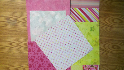
Most of the papers are from ColorBok "Party Animal Edition." There are two sheets of Miss Elizabeth and one sheet of gcd from the "Eye Candy" package. The striped paper from gcd is double sided and I'll probally use some of the backside too since it I feel it coordinates with the kit. The teal looking page is a piece of wall paper and the big flower paper is gift wrap. I had them and they matched the kit so they were added. I can't find my gate, so I left it off for now. My journaling spots are print outs so I will color them to match whatever I'm working on. I did include a few flowers I received from a swap, but I'm obbssessed with making my own flowers so I'm sure I'll do that. I included a silver leaf and beaded clump, but I don't feel they coordinate with my kit so they may have to get colored. I did include a pile of matching beads and I may make a coordinating bead embellishment and bypass the silver. I have lots of ribbon and lace since this is a mini album.

Tuesday, August 2, 2011

PIT Layout of the Week by Mercedes Pineiro her altered mailbox

I picked this really cool altered mail box by the newest member of the Pages in Time design team Mercedes Pineiro as our Layout of the Week. What a darling and fun looking project. She created such a feminine and pretty project.

I encourage you to take the time to check out her bountiful gallery and all the amazing projects she has to inspire you. She'll be a wonderful addition to the Pages in Time design team.

Here's a link to the original post:

http://pagesintimestoresite.ning.com/photo/my-mini-mail-box?xg_source=activity


You can follow her cute blog here:
http://stampwithmercedes.blogspot.com/